Main role: Systems Designer
Secondary roles: Level Designer, UI/UX Artist

Sunset Park's economy is nearly entirely dynamic: the prices of buildings, the church, and the city hall all change depending on the player's current situation, making gameplay feel a lot more fulfilling when trying to win an uphill battle or struggling to stay ahead.
The sheet to the right is an early version of my strategy analysis. Investment was not a very good strategy compared to simply selling back properties previously acquired, effectively removing any reason to move around the board and land on opponents' buildings.
As a result, I decided to allow players to give "rent" as a passive income based on their owned properties. This allowed players to invest more frequently and move on to different spaces. The After sheet to the right shows these changes.
The main challenge when designing UI for Sunset Park was avoiding clutter on the screen. While not ideal, our solution was to provide a menu players can use as reference to our mechanics. This allowed us to keep all our most important information in one easy-to-find location for the player.
Every space has its own window that appears whenever a player stops at its location. They each have a large area where relevant information is written so the player doesn't forget the effects of each option.
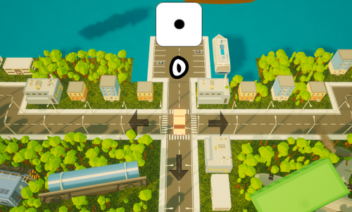
The first version of Sunset Park's level was bone-shaped and featured bright emissive icons that went red or blue, depending on the space's owner. There were only four types of buildings and a central bank space, for investing in stocks, at the bottom.
The map was split into four quarters, each holding a single type of building. This meant each "district" had to be perfectly balanced, otherwise players would not have incentive to visit certain locations on the board. My solution to incite more movement was to have opposite districts provide bonuses to each other.

After some initial feedback, I decided to mix the buildings together, which formed an almost entirely different experience. I enjoyed having spaces react to the player's choices, so I capitalized on that mechanic during the redesign.
My teammate and I both agreed players weren't exploring enough, so we shrunk the map to create scarcity in properties.
In addition, the game's flow was still interrupted by the incentive to simply buy and resell buildings as quickly as possible. In a second attempt to get players moving, churches were introduced around the board. These function similar to a Gatcha system using in-game currency.

Our final iteration saw mostly balance changes. My teammate and I got together and forged a plan to better plot out our buildings. Afterward, I ran some numbers and tweaked the layout to provide a more streamlined experience.
This update also removed the ties between building class and initial buyout prices. This allowed me to balance the economy more precisely. Now, there are endgame-esque properties lining the area furthest away from the start that can have significant impact in favour of their owner.
